Colours

Soft neutrals, deep hues, and joyful tones. All tuned to transform the way your space feels and sounds.

dbTimber

Bring in Warmth without the Weight. Three base tones. When grooved, the base reveals its quiet charm.

Match Acoustic Panels to your Branding

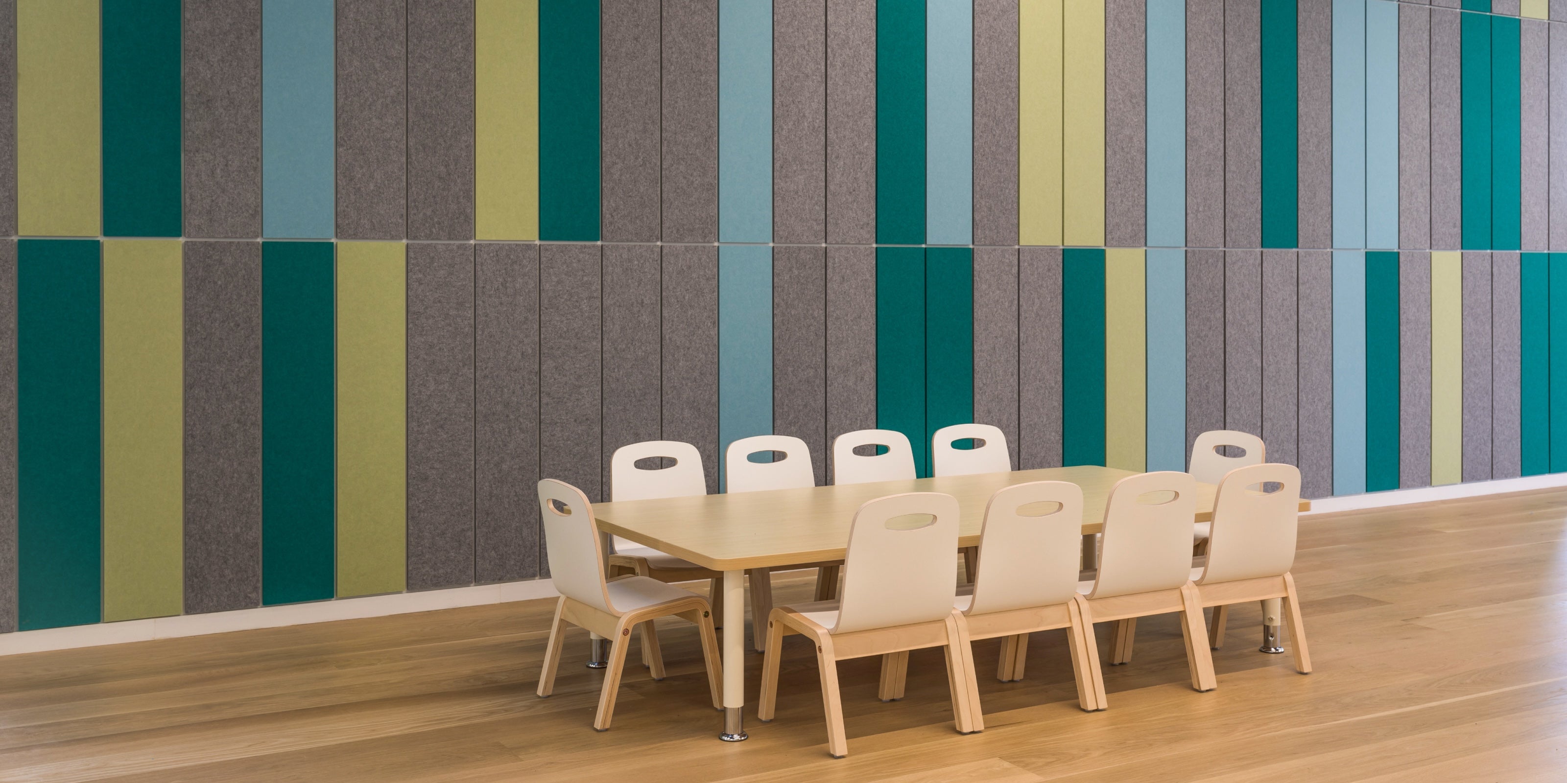
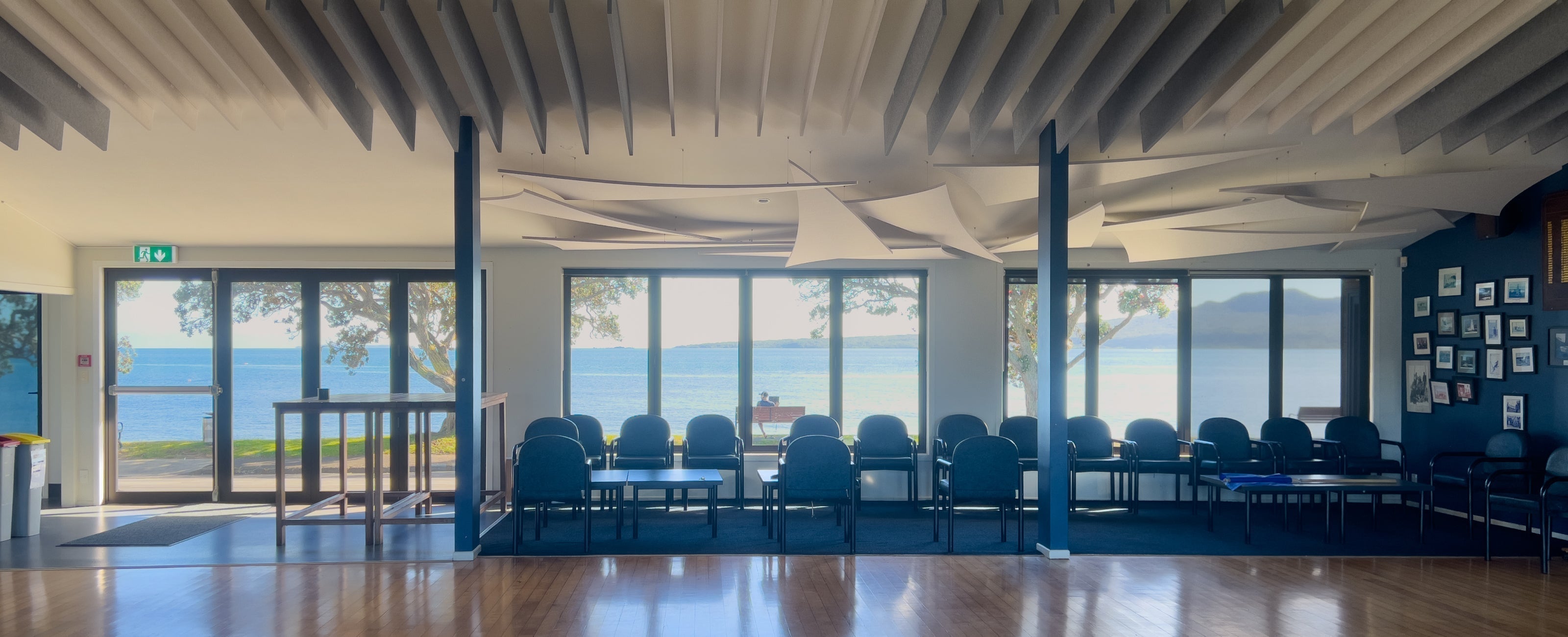
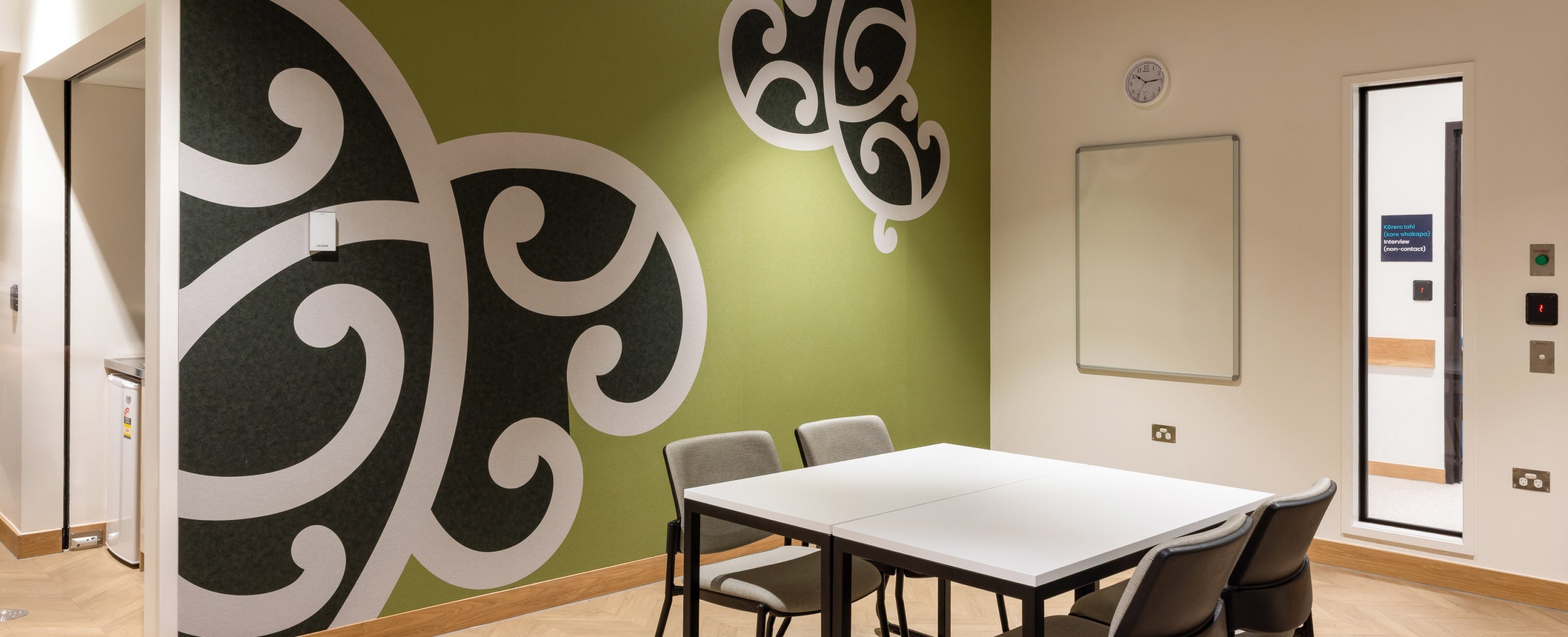
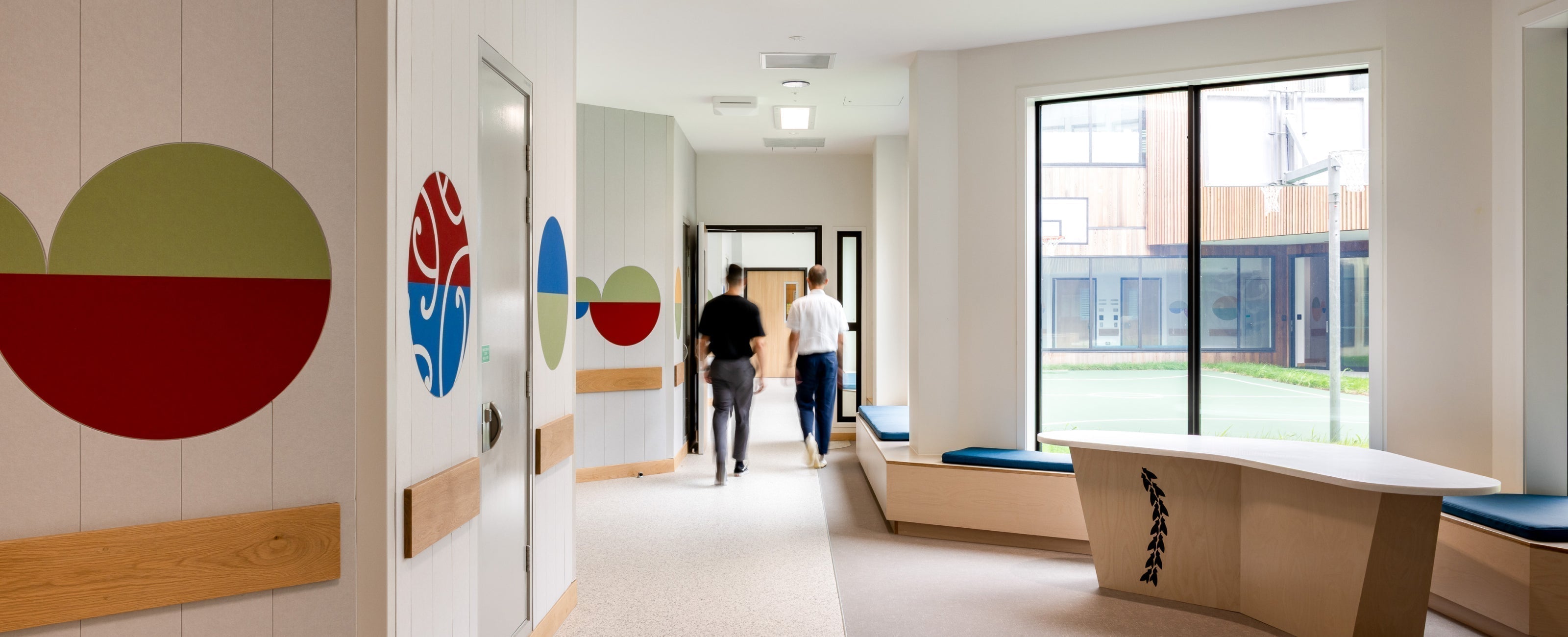
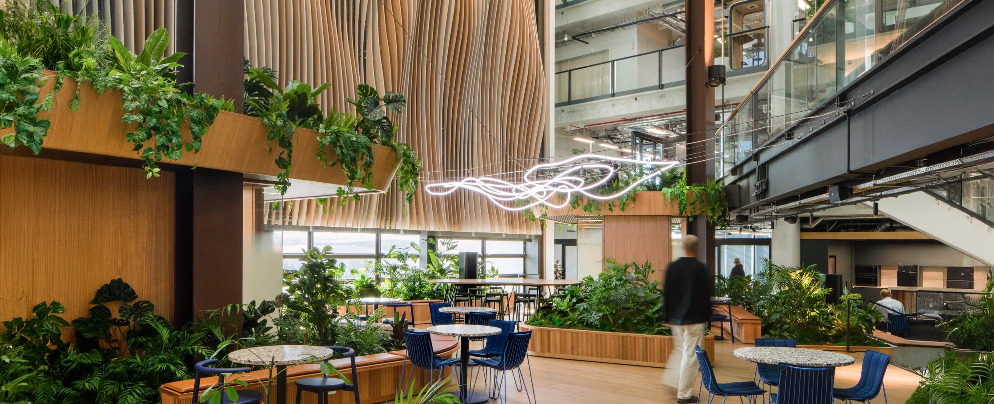
Acoustic treatment can do more than perform. It can show off your identity.

Our printing technology allows for a wide range of design applications, from typography and graphic patterns to artwork and photography, without compromising acoustic performance.

Acoustic_Panel_Print_Branding_Gallery5

Colour Matching your Acoustic Panels

We aim to achieve the closest possible match to your brand colours, supported by physical samples and swatch testing. Our design team will advise on the most appropriate base and print approach to achieve the best result.

Case_Study_Mason_Clinic_10

Choosing a Colour for Acoustic Ceilings

Ceilings shape how bright a room feels. We generally recommend lighter colours to help lift the space and reflect natural light. For maintenance, off-whites or textured looks can help minimise the appearance of dust build-up over time.

blog_cover_Movement_Pilates

Choosing a Colour for Acoustic Walls

Walls tend to take the most day-to-day interaction. Movement, touch, furniture, life. For that reason, we often suggest off-whites or deeper tones.

dbtile_Hero_Slide_1

Articles